As the world heads into August 2020, many countries, particularly in the West, are still reeling from the fallout of the George Floyd murder. The events of the past months have exposed the wounds of racism in werstern society and the long journey that must be taken before they are dressed and healing can begin. That those wounds will leave scars on society is not in doubt. Racism, to the dismay of many, is alive and well. We have been shown that it is even embedded in many of the ideals, policies and institutions that make up our government.
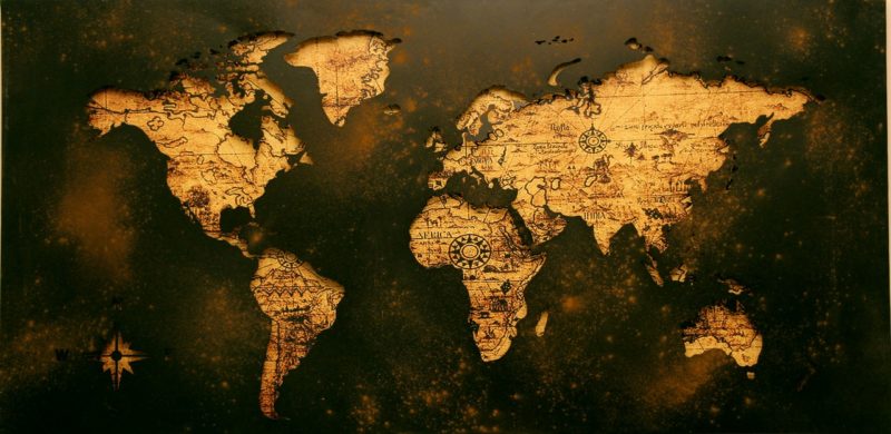
The offshoot of this, though, is a human tendency to keep looking for monsters under the bed. The linked video above began making the rounds a while back. The premise of the video is that the very maps we use, which are traditionally a Mercator Projection, teach racism and lifts those of European descent above all others. This claim is false, and with so much true racism around, our society does not need to focus on this fictional racism. While the following look at the video may seem a bit pedantic, the video is about 5 minutes of questionable assumptions and falsehoods. In an effort to suss out the truth, it is worth taking a look at some of the major claims found in that production.
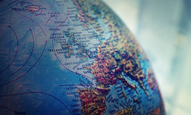
 Since the Universe exists in three physical dimensions, the only truly accurate map is a globe. However, those are not practical for most uses. Due to scale and the size, creating anything that would simulate the curve of the Earth and which could also fit folded or rolled up in the glove compartment of a car is not practical. To solve this issue, cartographers have had to figure out how to put a 3-D image on a 2-D surface. When mapping small regions of the Earth, accuracy is quite good in 2-D. However, the larger the area being mapped, the larger the distortions become. The job of the mapmaker, and the choice of the consumer, is around which distortions are accepted and which ones are minimized. It is these choices that influence what the map looks like in the end.
The sad part of this exercise is that, to quote Fox Mulder, “the truth is out there.” In today’s webbed society, finding information is not hard, but knowing what to believe can be. A simple search of Wikipedia on this subject, and of Mercator the projection and Mercator the person links the researcher back, in many cases, to original documents. While Wikipedia itself can be a questionable source, it can also be an invaluable tool to locate primary source documents that are accessible and reviewable. In this instance, it was like exploring a warehouse of facts with all the relevant information clearly sourced, which makes the following claims so much more sad as the video launches into the evils of the Mercator Projection Map.
Claim 1: White people’s countries are larger than other countries on the map.
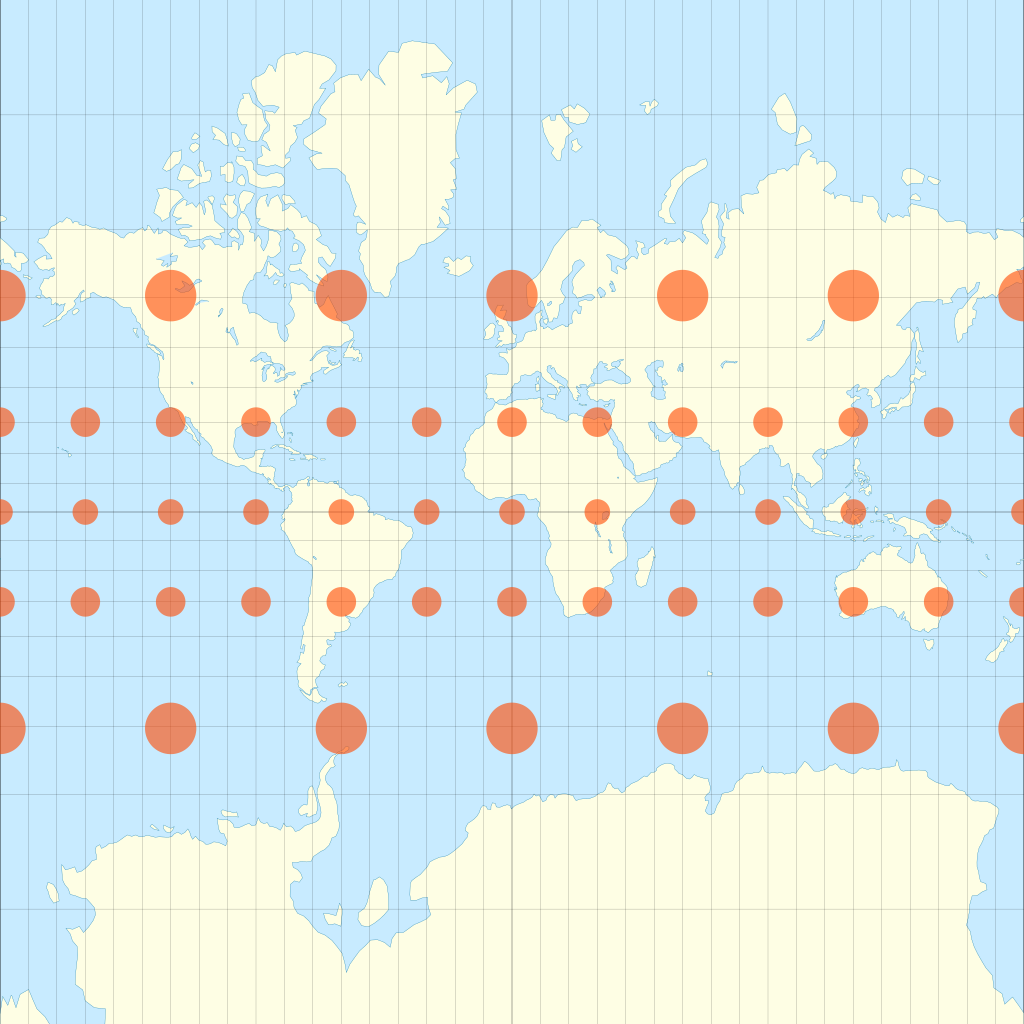
True (however): Mercator projections elongate the map vertically as the cartographer draws closer to the poles. There is more land mass in the Northern Hemisphere and closer, relatively, to the North Pole than in the Southern Hemisphere. That those northern land masses tend to have a greater white population is more a function of migration and has nothing to do with the drawing of the map itself.
Claim 2: Larger white people countries is how racism gets subtly taught in school
False: Size of landmass is in no way related to importance. It would beg belief to hear a claim that a student had encountered a teacher who would teach that. In early geography and history studies students are taught that putting a globe on a piece of paper makes things distorted. That’s why they look so weird compared to the globe. The video’s argument may hold water in a school system or society where all globes are banned, but that would be an odd policy for a school system to have. It’s not like schools, libraries and white people hide all the globes so no one can see what the world really looks like. Besides that, if this claim would be taken to its logical conclusion, then the penguins of Antarctica are the most important inhabitants on the globe.
Claim 3: The US is in the middle of the map.
True (however): If you draw a map, something has to be in the middle. If the map is published by a US publisher, perhaps they simply put their continent in the middle. Possibly it helps balance out the oceans. If the USA is in the middle, so is Canada, and the countries of Central and South America. Again, the video is assuming an intent that can not be proven. It is simply a design choice made by a publisher.
Claim 4: South America (and other countries) are 9 times bigger (in reality) than...
True (however): Remember the opening paragraph about distortions? South America and all landmasses south of the Equator are distorted at the same rate of distortion towards the South Pole as landmasses north of the equator are to the North Pole.
Claim 5: The Equator is not in the center of the map.
True (however): Many Mercator maps are not drawn with the equator at the middle of the map. At the South Pole lies the big blob of Antarctica. It is not divided up into countries or political boundaries, which is the purpose of the maps under discussion here. In reality, the closer the Equator line lies to the middle of the print, the more of Antarctica (the boundaryless blob) that has to be drawn. On most maps, it is just a large white area, although the printers could make it a different color if they wanted.
There are also significant land masses with political boundaries near the North Pole unlike the South Pole. Instead of having a lot of unused blank Antarctic space, the choice is made to “crop” the image so that northern landmasses closer to the pole can be rendered easily. It makes editorial sense to crop the map to include those areas while also not having to print a huge area of snow colored paper just to keep the equator in the middle.
Claim 6: Here we have random assertions that the map was commissioned by “the” Pope to demonstrate the spread of Christianity.
False: Not even close. Mercator was Belgian and lived in a hotbed of the new protestant reformation movement. . There is evidence that Mercator may have been a closet Lutheran and it is known that he had escaped being captured by priests from the Inquisition. Priests, who if they had captured him, would have subjected him to repent by force, with torture and imprisonment on their spectrum of tactics. The pope would not have been on his Christmas card list. This claim also ignores that fact that his benefactor, the person who actually paid to have the map made, was Belgian and likely protestant, too.
The original map includes a significant amount of latin writing on it, and one of the things it says is why the map was produced. In his own words, Mercator states that he chose to use math to create this projection for three distinct reasons: navigation (latitude lines are equal length), correct shape (not size) of known land masses, and to create a map including as much information from current and ancient sources as possible. There is nothing on the map to indicate it had anything to do with religion.

Claim 7: The “correct map” that she shows.
False: There is no such thing as a “correct map”. She displays a Gall-Peters projection which is not a favorite of cartophiles. Like all 2-D maps, it has its own set of distortions. This projection shows relative size better, but stretches landmasses in a different way. It makes different choices in layout and editing for its own purposes, but this does not make it “correct”.
So why did the Mercator get so popular? At the time, it was one of the better maps for navigation. Shipboard navigators would use Mercator Projections along with other types of maps. This type of map preserved shapes, had nice straight lines with 90 degree angles, and fit on a rectangle of paper really well. Ease of use, ease of printing and tradition are elements that lead to it becoming one of the most popular projections printed over the years. The Chinese independently developed a star map that used the same math and distortions as Mercator chose which shows that his solutions to map making were not culturally unique.
In the end, the point of all this, again, is to encourage people to keep their eyes on what matters. The fight to end is important and it is real. Society has to eliminate unfair policies and root out indefensible presumptions. In order to do this, people have to make sure they are addressing the real monsters, not the ones that someone makes up by trying to be clever. This map projection is just a map projection. The whole “the map is racist” trope smacks of revisionist history, and this is “history” which won’t move anyone forward. .


Always made me laugh at how large Greenland was compared to the USA. Not even close. If you really want a laugh, check out the Flat Earth Society that postulates that the Earth is flat, not a globe. Their maps are hilarious.